In Defense of Walkthroughs
by Andy
Clear
Max Rudberg recently published a post decrying the use of walkthroughs — an introductory series of panels — in an app. He cites Clear, Rise and Solar as “novelty apps” that sacrifice standard interactions for a minimal UI, and as a result have to pay a price of an multi-step tutorial to teach the user how to use the app.
I disagree with Max’s basic premise, I think that walkthroughs/introductions/demos have an important role to play. Clear, Rise, Solar and others should be commended for pushing UI design forward and experimenting with gestures. We are still very early in the era of touch based interfaces and so investigation should be encouraged. But because these gestures are new then there will there has to an some element of education somewhere along the line.
We forget, but touch based smartphones were new at one point in time, and the “basic” gestures were unfamiliar to every-one. But the genius of the Apple ads is they show the iPhone in use with hands and fingers interacting with the device (compare that to the vast majority of the Android ads that stress specifications). The ads were, and still are, an effective walkthrough and tutorial for every app. Without those ads every-one would seriously have to contemplate showing a walkthrough.
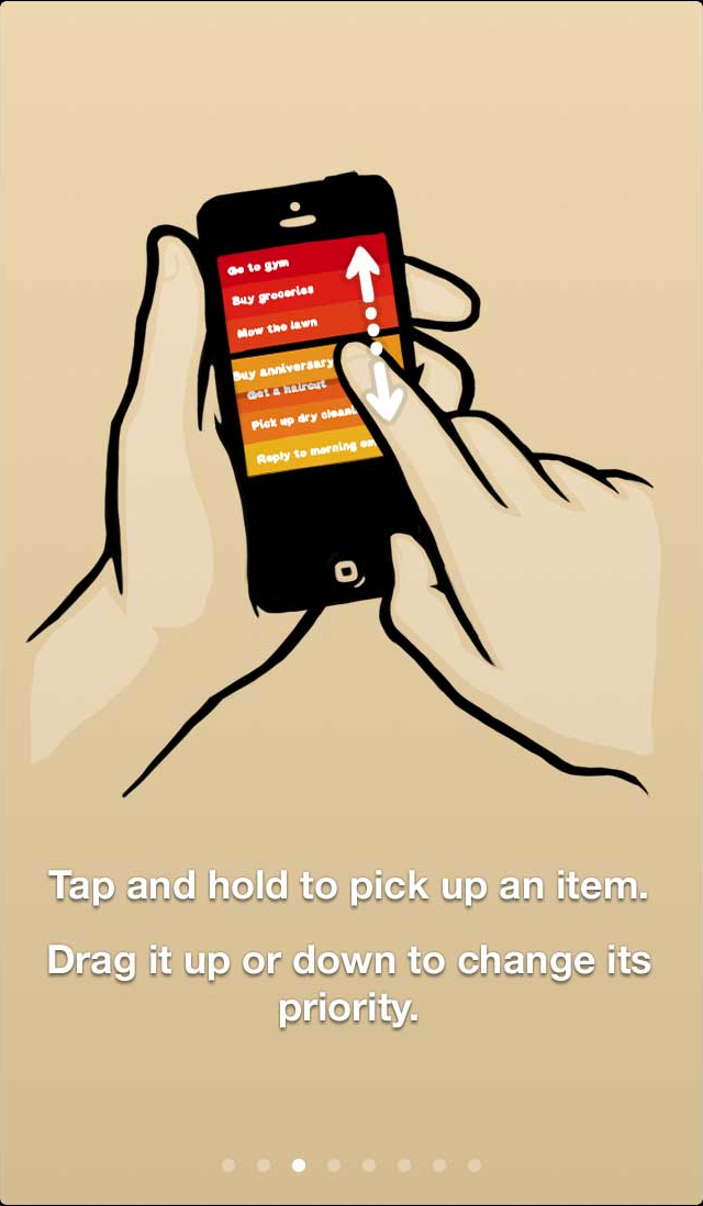
Rise
One of the challenges is selling software, and apps in particular, these days is that there is no real sales process. We browse on-line stores and in a single tap have purchased a product we’ve barely spent any time researching and understanding, and we definitely have not had a guided tour of the app’s compelling features. I suspect very few people read an app’s description — I know that I rarely do, especially if the description is loaded with “voted best …” quotes. A couple of pretty pictures and we’re sold, what’s a buck or two if it doesn’t work out? So as a software developer, our only chance of inserting ourselves into the sales process is in that very first launch. It is only then that we can thank the user for selecting the app and describe a few of the compelling features they might otherwise miss.
Consider a gym club. Once you’ve filled in the paperwork, some-one will show you around the facility pointing out particular items and explaining protocols. Most clubs have “standard” capabilities and I’m sure we could all muddle our way through eventually, but the club doesn’t want to take that chance. They want to ensure that you have the best possible experience and that you will come back. I recognize your app purchase may be on impulse, that there was perhaps very little research, therefore I’m going to take a small amount of your time to set you up for success.
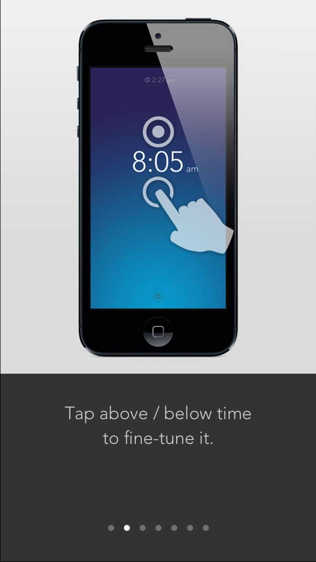
Solar
I’ve never understand this macho “I don’t need no stinking documentation/training/tutorial” approach, and then get annoyed when it doesn’t do what I want it to do. Many years ago at a previous company, we had a customer who was adamant about not paying for any training or receiving any kind of assistance. Needless to say that he jumped straight in, completely missing a critical component of the setup, and proceeded to bad mouth us for crappy software. That product did not have a walkthrough or something to guide the user to the critical components first, nor did it have a non-standard UI, so we had a user flounder around for a bit, eventually dumping us for a competitor.
Many users are timid, they won’t explore or touch items they don’t undertand, many times they don’t even see an element on the screen even if it conforms to every standard practice in the interaction guidelines. The purpose of a walkthrough should be to encourage the user, to give them the sense of what is possible, to introduce unique features, to say that I care about their success. If that extra minute is what I have to pay to keep a successful customer then I’ll take it.
